Global Authentication App for PayIt
The Problem
PayIt had long touted its ‘single pane of glass’ approach that brought value to users by letting them make multiple government transactions in one place, and also gave them universal credentials to use in any PayIt-supported app. However, this was not well presented or communicated to users, so they weren’t benefiting from the value of those features. This problem was highlighted when PayIt acquired another company and wanted to bring their product under the same login umbrella to bring the value to a new set of users. The acquired company’s legacy login was poorly designed and caused many support issues. The work was started to:
Make the value of a PayIt login credential apparent to users and simple to use
Improve the acquired product’s login experience and bring them under the PayIt umbrella
The Results
-
The acquired product had a legacy login system that cause support issues to the tune of $300k annually. The new design decreased support contact ratios by 80%
-
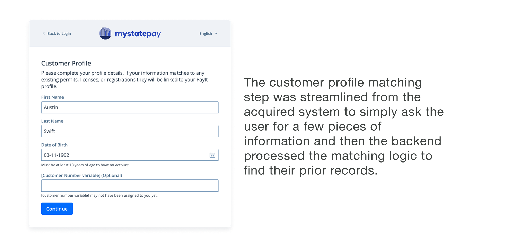
In the legacy system, users had to enter some personal information to find their historical records and tie them to their account. We had to maintain this system in the new PayIt Login but managed to increase the success of that process by 42%.
-
Agencies on the legacy login are expediting their move to the new login. Agencies who have yet to launch their apps are excited to go live with PayIt’s Login.
-
NPS scores are higher for apps with PayIt Login than apps with the legacy logins.
The Process
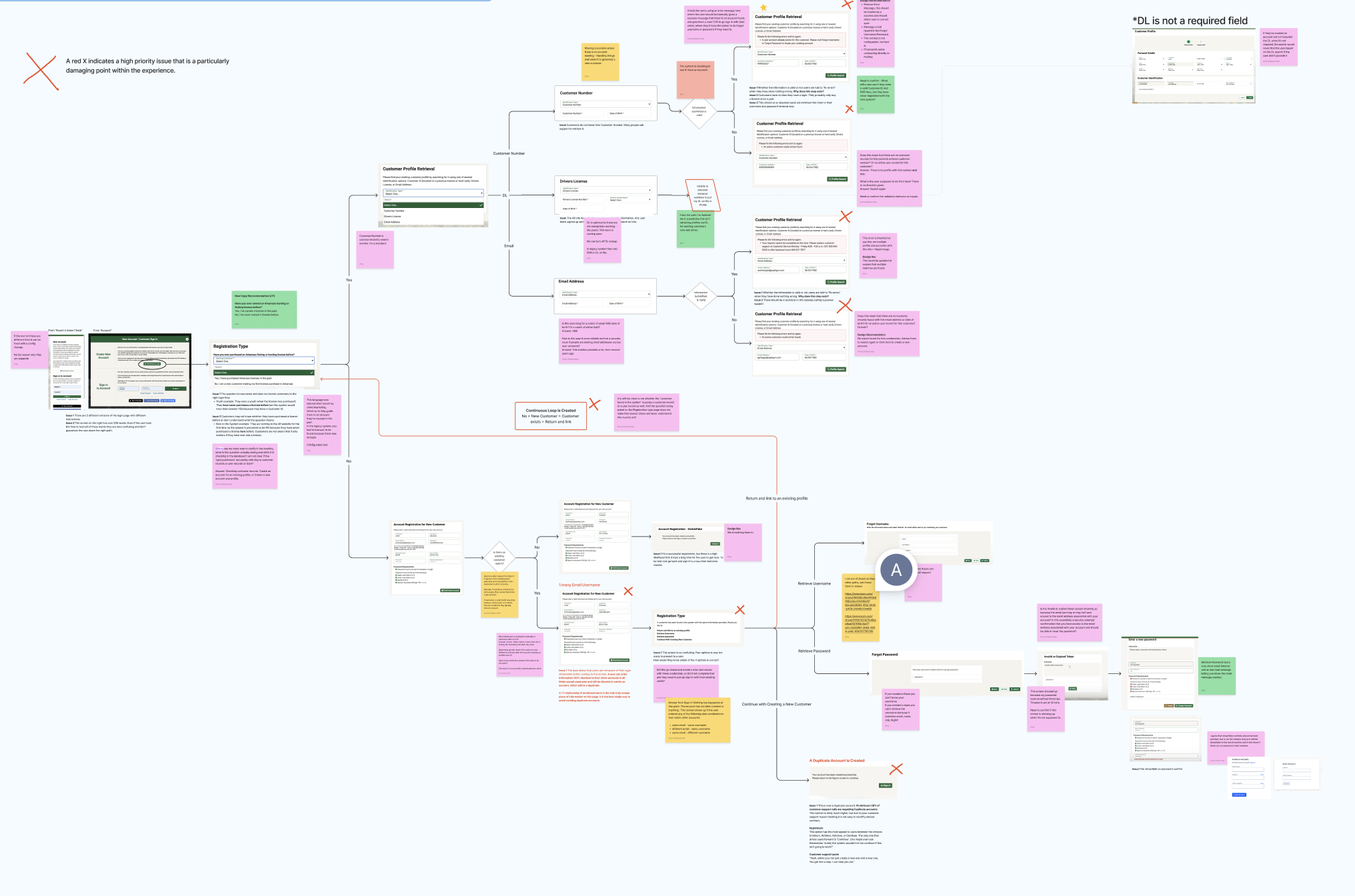
I started by working with a big cross functional group, mapping out the current state of both platforms, identifying pain points in current processes for both, and setting goals for what we wanted to improve upon in the new system.
Our analysis revealed significant user friction. The core pain points discovered were:
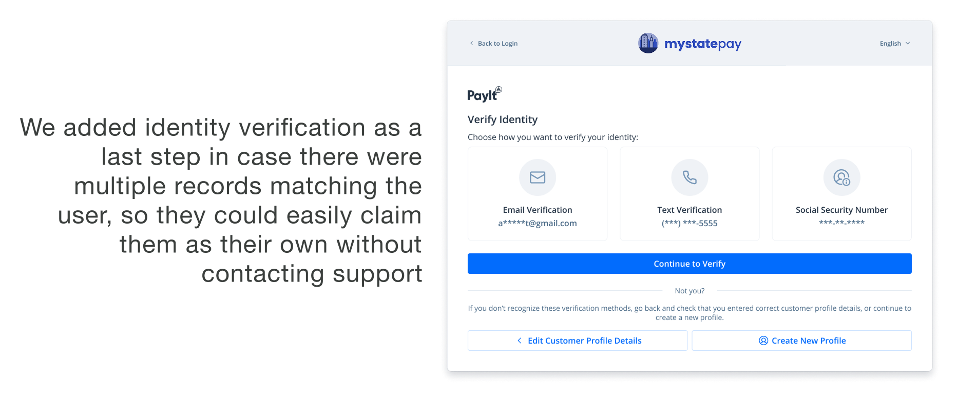
Burdensome Record Linking: While the system aimed to connect users with existing records, the process placed the entire burden of discovery on the user. They faced complex decisions and unclear language during account creation and login, often requiring them to recall interactions from years past. This, plus poor data hygiene, led to creating many duplicate accounts and frustrating account lockouts.
Confusing UX/UI Patterns: The acquired system's UX/UI patterns deviated from industry best practices, causing considerable user confusion. For instance, success messages were sometimes displayed in components designed for error messages, creating a disorienting experience.
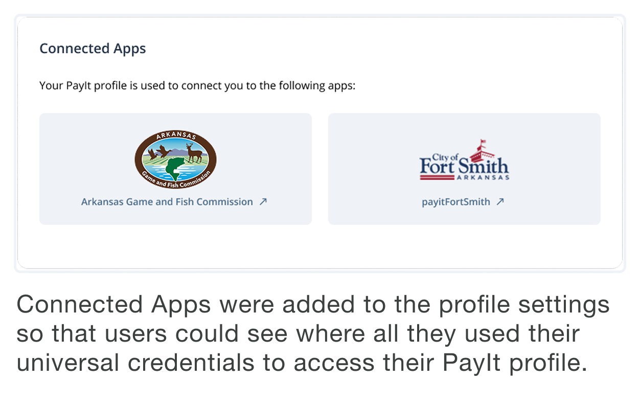
Undermining Universal Credentials: Both the acquired and legacy PayIt login experiences were designed to appear specific to individual government agencies. This obscured the significant benefit that PayIt credentials actually work across multiple supported applications. As we unified these companies, it became critical to clearly communicate this universal access, allowing users to consolidate all their payment and activity history under a single, convenient credential.
Out of this discovery, we defined two critical solutions to enhance the user experience:
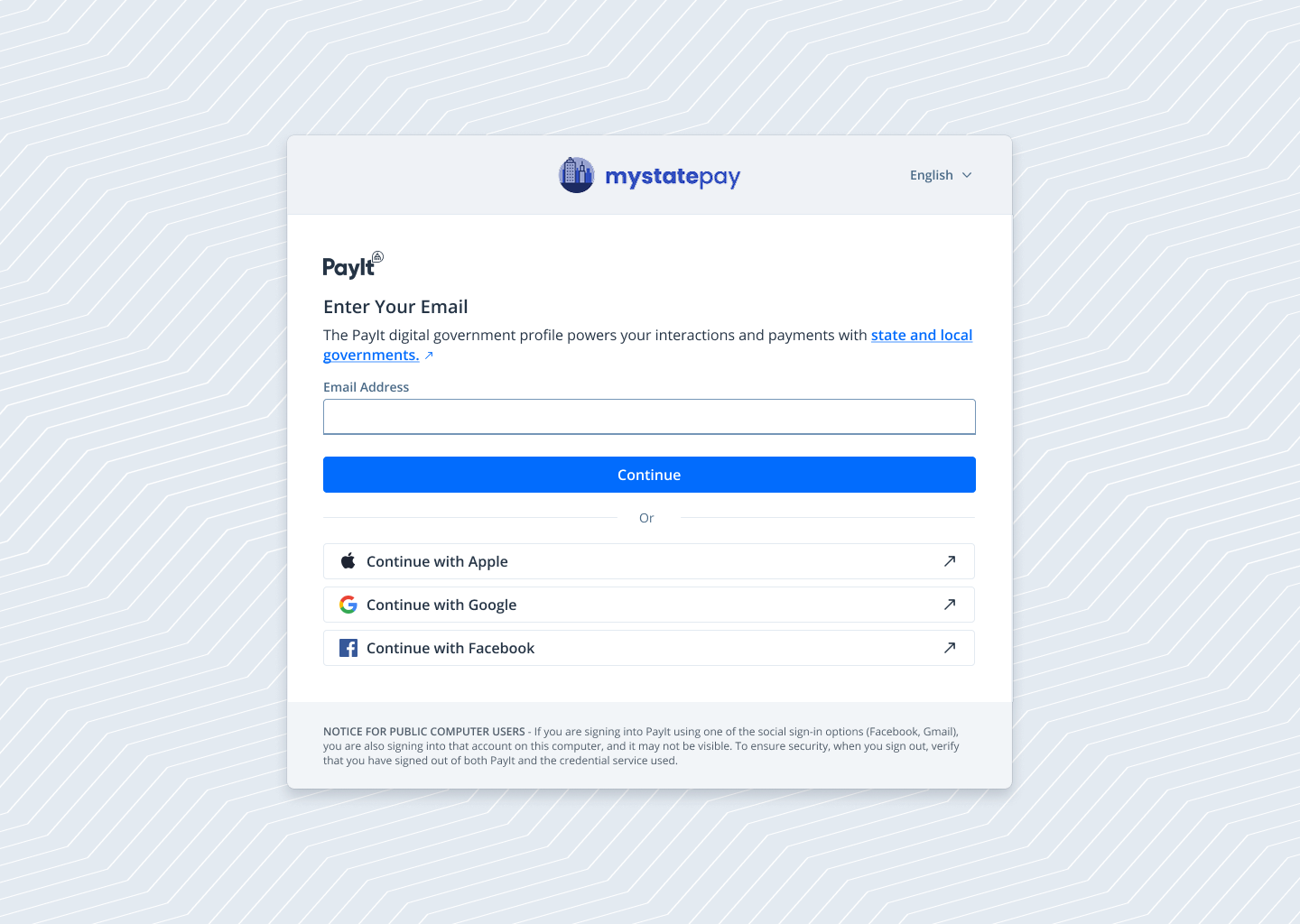
Building Trust and Highlighting Value: We set out to build user trust by making the universal PayIt credential more apparent and co-branding the experience. We needed to communicate that PayIt was a secure and trusted partner of their local or state government.
Effortless Record Migration: We aimed to help users seamlessly find and attach their records from the old legacy system to their new accounts, without placing the burden of this complex task on them.

The Designs
We initially explored several modal-based login versions designed to seamlessly overlay any PayIt application. However, after careful consideration, we landed on implementing an OAuth-based login that could be configured as it’s own standalone application and integrated with any PayIt-supported app now or down the road.
The earlier research helped me find the most important parts of the system for users, considering their needs, the data models, and technical limitations. I simplified the experience from about 18 possible screens to 6 at most. Most users only needed 3-4 screens to successfully log in and match to their existing records.
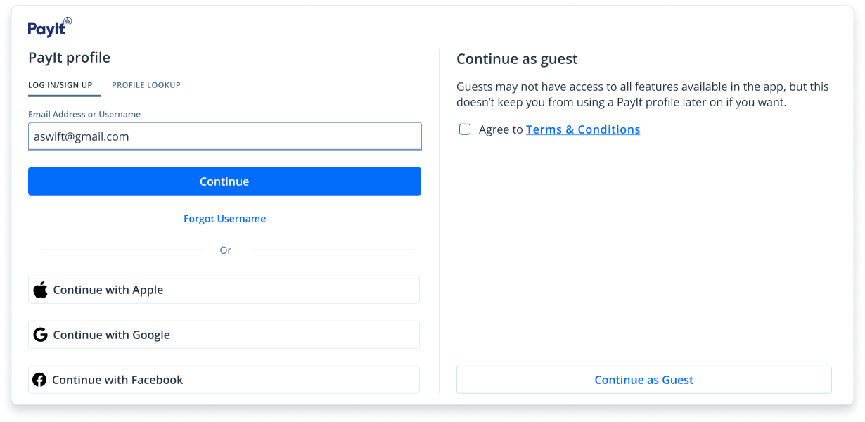
Final Login Start Modal
Early stage wireframes
To address the trust issue, we brought the PayIt name more forward than in the past. We also included a link out to a page that showed all the government agencies we work with where they could also use this credential.
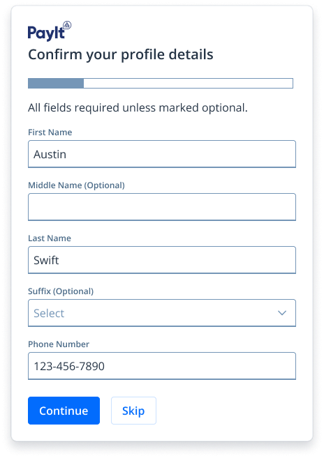

Designed additional features to simplify the process for user and build trust
Results
Users have overwhelmingly preferred the new PayIt Login over the legacy system.
-
The acquired product had a legacy login system that cause support issues to the tune of $300k annually. The new design decreased support contact ratios by 80%
-
In the legacy system, users had to enter some personal information to find their historical records and tie them to their account. We had to maintain this system in the new PayIt Login but managed to increase the success of that process by 42%.
-
Agencies on the legacy login are expediting their move to the new login. Agencies who have yet to launch their apps are excited to go live with PayIt’s Login.
-
NPS scores are higher for apps with PayIt Login than apps with the legacy logins.